The purpose of this post is to accentuate the subtle but important aspect of having a visual component in the application process. Now this seems *very* obvious and I'm sure everyone thinks this but to really nail it down is something that I don't believe many people have done. The purpose of software is to be powerful and easy to use. It should do *exactly* what is purports but theoretically should be able to be done in one click / tap.
Look at the following pictures. Which one appears more fluid?
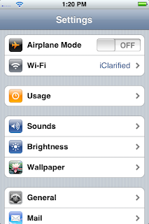
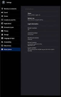
I'd argue the left one and for a few reasons.
1. Color Differentiation - Human beings are visual creatures with highly tuned eyes to allow differentiation of objects. Apple has taken advantage of that by coalescing the icon look to be stereotypical of the setting title (photos is flower) while making sure to change colors on each one. This allows faster navigation of the menus because you can intuitively track where things are based upon color. The Android menu is black and white though still uses pictures. It appears by lacking color contrast you are actually confusing the user because how natural is it to experience black and white in everyday life? By going against the biological system of the user, systems that are finely tuned for many things, you are hindering the interface.
2. Too much text - The less text the better. The best interface is one where you don't even need to read anything. Games such as Angry Birds, does this incredibly well because they use pictographic means to navigate across menus. Apple vs. Android systems show this again.
3. Layout - This goes with point 2 which is apple makes you drill down into the menu. The idea that you should *only* be shown the screen you are on is an idea I like very much. It helps keep cohesion and prevent confusion.
This Facebook interface shows the thought that must go into the filtering of a tremendous amount of information. This is another part that has come to light after doing a lot of initial research. All systems have data filtering to one degree or another. Having thoughts and interfaces that take advantage for navigation need lots of optimizations. Listed above are a few but yet another is the logical filtering of information. What is the main purpose of the system? What information hierarchically lies above another? How can you segment up the raw data into easy to find ways? Facebook shows some nifty ways on achieving success with an obscene amount of data.
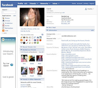
Here you can see the picture shows prominently on the screen with the navigation bar on top filtering to what is most important to the user. Profile or Newsfeed I would argue are the most important.
Which is why the Profile page now looks like this (Newfeed when you login)
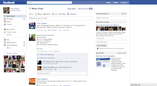
Facebook decided the Newsfeed was the most important and rearranged the title navigation bar. Search and Status boxes are centrally focused along with having the auxiliary pieces like messages, requests, etc. shown in icon form on the top navigation panel with the overlay if something new happens. Again, taking advantage (and interesting effect) of the visual system of human being.
Point 2. Know the purpose of the software and your audience. Use location/spatial organization in order to funnel actions towards where it is most needed / desired.
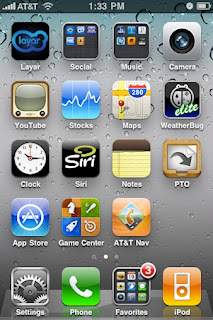
Point 3. Less is more. Looking at arguably the best designed interface in the world (and the current shift from OS X to the App Centric Design) is very intriguing. What was found here is the less text/information to process by the user the more successful the interface is. Here you can have a maximum amount of possible "actions" by the user which helps filter where they will go along with reducing the information processing needed. The dock in the bottom allows for even more reduction because these are persistent no matter where one goes. Think about the infinite combinations of the Android desktop? Each developer can make their own widget? Widgets are a plethora of choices? And you have at least 3 screens to add all these widgets. Much too much information. Apple /just/ added the ability to have notifications in a drop down menu. My bet is because having a user base get acclimated to the system is important plus knowing a maximum amount of actions that should be allowable is needed research. Apple only lets Apple have information pop up into their notification bar and only they can add custom features to the home screen.
This provides good initial foundations for going forward in the research along with having this *core* to the design/functional/development process for the weather app. Code updates, research paper findings, and general good stuff will be continually updated as the summer progresses.
No comments:
Post a Comment