Sunday, August 7, 2011
Designing Interactions Part 1
As part of the conclusion of the summer's work, I have been making sure to get through as much of the researched books to consolidate the most important aspects. Having gotten half way through Designing Interactions by Bill Moggridge has given me a tremendous amount of information. If you are interested in this field, having this as the first item of deep reading is critical. The history of interaction design in computing is a fascinating piece. Moggridge goes from the beginning and shows how the evolution of interface design and experiences has led to the machines of today. Understanding this is one of the best foundations for approaching design in an entirely different manner.
Tuesday, July 19, 2011
UI / UX Papers List
As one of the goals of this project, having a list of authoritative resources that are updated and/or have been reviewed as important milestones in design was my goal. After initially having the thought that chronological order would be the best way to show the direction user interface / user design/ human computer interaction is headed I came to the conclusion, which was not initially obvious, to not focus on the chronology of design. As Donald Norman said, too much knowledge sometimes leads to the same design mistakes. For those interested in seeing the best breakdown I've found of data analysis on HCI I'd refer you to this paper.
A list of resources that have been my guide and conclusion of the direction of design can be found below. The most concise information I would recommend is using the list of books in the order presented. A great deal of thought was given to the direction of the books chosen and their importance in the field of design. The additional links can be found to offer supplemental help.
Web Resources / Blogs:
Core77: An update-to-the-minute example of all things great with design. Simplicity and innovation are staples of what is on this magazine. Though not specific to software development, design in general should not be pulled from one discipline. It should be centric to the user of whatever is being made, borrowing from many areas of life to ensure maximum output. A great place to spur ideas when designing anything.
Donald Norman's Website: Responsible for several authoritative papers/ideas in user interface design, Donald Norman's site provides a plethora of more formal documents to help one gain as much research in this field as possible. Not like a Core77 magazine that provides quick blurbs about design, Donald's site lets you dig deep into books, papers, research and his own thoughts. When I'm looking for something deep and specific I generally scour his website to see if someone has offered some insight into this domain.
Books
Designing Interactions by Bill Moggridge (Online available) This was one of the initial books I've found but have found myself turning back too many times. A simpler approach to common interaction ideas when designing an interface and making some usable. Thinking about the big picture in a different way can help begin to digest what others say about interaction/interface design.
Designing with the Mind in Mind by Jeff Johnson Amazon Link A unique stance on design that is raved about by authorities in the field. The psychological aspect is why this book really stands out. I'm a strong proponent (prior to research project even) that psychological factors play huge roles in everything. Think book helps meld this into the design paradigm.
Don't Make Me Think by Steve Krug Amazon Link
Usability / Testing are part of the core concepts in this book. Once you think of the situation from the
The Inmates Run the Asylum by Alan Cooper Amazon Link After seeing, and grasping what some great minds think should be useable reading Alan Cooper's book really nails down where we are today. How business decisions affect design and how engineers, those interested in being challenged by hard questions, are designing things in like fashion. Encapsulates many examples while drilling into why it can be better, and needs to be.
Living with Complexity by Donald Norman Amazon Link The completion of five books that will completely change the way you look at interfaces and the world. By seeing such a horrible picture painted by Cooper, Norman argues that the complexity can be tamed. There is light at the end of the tunnel.
Research Papers
Books offer a better direction I have found than the research papers in this domain. A list of the most cited papers can be found by this paper which offers some potential routes for definitive papers in the field.
Additional Resources
Mobile User Centered Design
This is an article talking about the user centered approach in mobile design. Having found the ideas around user centered design for UI/UX it seemed appropriate that I stumbled upon this article for mobile. It has helped influence my thought process and mock-ups.
Pixar Designer rethinks iPad App: Every once in awhile you see something done so completely differently that it inspires you. This is one of those. Having an iPad app that completely changes a childs book via technology is mesmerizing. This can really give someone a spark to do something great (and different).
Code Developments:
Working on the XML parser for iGoogle has been where things lay right now. Also, I have been simultaneously been working on how to implement some of these UI elements into the layout.
Google+ iPhone App Example
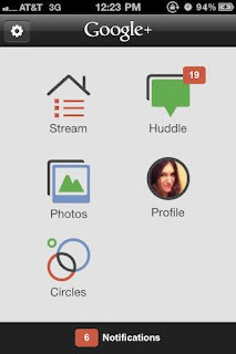
Upcoming Presentation: This Friday I'll be giving an update presentation on my progress. I'd say most of the research aspect and rethinking how I approached design in the past is complete (for the summer's goal list). I've been working on the parser for iGoogle XML weather feed while simultaneously building out UI.
Friday, July 1, 2011
Code Development Update
When initially creating this project having Android OS API version 3.1 was a target goal. After having some design sessions and creating the prototype (see below) I became aware of my target audience a bit more. Designing the application to be easily usable by everyone was one goal but what sort of design would it be to lock out many users from taking advantage of what I was making. One could argue that this does not directly influence the design but it became apparent *because* of the design flow I've been meticulously documenting and researching.
1. User Audience/Accessibility - After looking through the amount of devices running Android 3.1 it became clear that having this limited to users because of hardware was not necessary. Creating the most widely accessible application become a design goal. The OS version was downgraded to the most baseline version of Android. The new target platform is Android 1.6 and will hit over 99.99% of all Android devices when it is available.
2. Simplicity - After designing the first prototype for the system, I got a clearer picture of the small amount of information that needs to be pulled in order to be successful.
3. Widget - One of the two great features of Android over iOS is the Widget. Having this small bit of information always updating on the homescreen can give users the most important information immediately without ever having to open an application. By designing the prototype, I quickly saw that the information is so minimal that once the location is set one can assume they will want the current location as the main source of weather information. And the current temperature is most likely the most needed piece of information.
4. Live Wallpaper - This is one of the best features of Android yet underutilized. Having the ability to "take" over the user's home screen is incredibly important. This gives even faster access to the information. Live Wallpaper + a widget renders the launching of the app useless. Optimization at its finest.
When looking through the most successful weather applications and most well designed ones I came across quite the find! The best looking ones had the most downloads! Moreover, they utilized these notes above in order to get widest appeal and use.
If we look at one utilizing both, it is between 1-5M downloads. Market Link
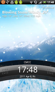
Two great examples of the nice live wallpapers used by one of the best Android weather apps.
Those previous two are the weather application created by Google that comes stock on many new Androids. This is also very simplified but I don't believe many people look at the chart.
 http://www.thedroidgeek.com/2010/04/android-widgets.html
BeautifulWidgets pretty much encapsulates the importance of this project (RCOSUIR). The best looking widget for weather is rated in the top 5 of all Android apps. People across all phones want a usable experience (and customization).
1. User Audience/Accessibility - After looking through the amount of devices running Android 3.1 it became clear that having this limited to users because of hardware was not necessary. Creating the most widely accessible application become a design goal. The OS version was downgraded to the most baseline version of Android. The new target platform is Android 1.6 and will hit over 99.99% of all Android devices when it is available.
2. Simplicity - After designing the first prototype for the system, I got a clearer picture of the small amount of information that needs to be pulled in order to be successful.
3. Widget - One of the two great features of Android over iOS is the Widget. Having this small bit of information always updating on the homescreen can give users the most important information immediately without ever having to open an application. By designing the prototype, I quickly saw that the information is so minimal that once the location is set one can assume they will want the current location as the main source of weather information. And the current temperature is most likely the most needed piece of information.
4. Live Wallpaper - This is one of the best features of Android yet underutilized. Having the ability to "take" over the user's home screen is incredibly important. This gives even faster access to the information. Live Wallpaper + a widget renders the launching of the app useless. Optimization at its finest.
When looking through the most successful weather applications and most well designed ones I came across quite the find! The best looking ones had the most downloads! Moreover, they utilized these notes above in order to get widest appeal and use.
If we look at one utilizing both, it is between 1-5M downloads. Market Link


Two great examples of the nice live wallpapers used by one of the best Android weather apps.


Those previous two are the weather application created by Google that comes stock on many new Androids. This is also very simplified but I don't believe many people look at the chart.
 http://www.thedroidgeek.com/2010/04/android-widgets.html
BeautifulWidgets pretty much encapsulates the importance of this project (RCOSUIR). The best looking widget for weather is rated in the top 5 of all Android apps. People across all phones want a usable experience (and customization).
Wednesday, June 29, 2011
Mock-Ups Round 1
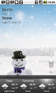
 http://www.openamazing.com/wp-content/uploads/2011/05/Shine-Weather-at-a-Glance-iPhone-640x467.jpg
Shine for iOS is a perfect example of the tenets of user interface design and experience being integrated into data presentation better than many other applications. This delivers a popular experience for they took note of many specific needed lessons.
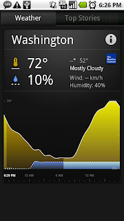
 http://cdn.androidtapp.com/wp-content/uploads/2010/04/The-Weather-Channel-Now.jpg
The Weather Channel app presents too much information to the casual user and in a non clean way. When one dissects what a casual user would want on a weather application a few pieces of info come to mind. Where is the weather report from? What is the current temperature? What is the current weather? What is weather in the future? Reliability of the future forecast. *Maybe* What is the wind?
With those determined pieces of information we can see why the Shine app succeeds and the Weather App fails. The information on where you are should be presented at the top of the screen since all further information derives from it. Since the focus of the app would normally be current weather/temp and then forecast the screen needs to be broken up nicely as such. Having a constant navigation bar on the bottom is the typical method for Android for navigation. It could be used for more power functions and then leaving the main screen for these simple pieces of information of Location, Current Weather, Current Temperature, Upcoming Weather (5 Hr?), Upcoming Temp, Reliability

This initial mockup for the OSWeather (Open Source Weather) shows the reliance upon a single screen that presents this information in the fastest way possible. A picture depicts the weather best over any sort of text while the temperature needs to be a static number that can be focused on the center of the screen. The forecast will lie directly below this and show one large number for a 5 hour forecast in the future. Since we want to keep a similar format, we'll use another picture with a temperature and percentage underneath in order to depict the forecast.

This brings us to this final mock up design for the application. A couple points to note here which give it a very non cohesive feel which will need to be addressed in the actual application. The images are not branded the same which give us a clear disconnect. The font is a plain style. The white background on top as a placeholder does not mesh with the general look of the application background (which will need to be the same).

And after a bit of work on getting consistent color scheme and feel to the application, the final mock-up with the resources intended to be used emerges...

Sunday, June 19, 2011
Telling a Story
After a hiatus due to travel, a blogpost that encapsulates the last ~ week of research and work is due. This helps the interested student, researcher, coder, designer, and/or person understand an *amazing* resource for this thought process. Bill Moggridge, designer of the first laptop computer, presents a compelling story of how design should be done and is done via his book Designing Interactions. The link is below:
http://www.designinginteractions.com/bill
Thought one would need to read this book many times, and I cannot pretend that I am a season veteran (or have finished the book, yet) but there are some notes I have already uncovered reading Bill's words. His initial foray into this book starts with personal stories relating his thoughts in a more personal domain to the reader. *This* by itself is designing an interaction in such a way that the domain the user is experiencing it will be most optimal. From my initial findings there are several contextual design lessons that have surfaced.
1. Understand the Guest - This means that when you design any piece of software (or anything) you have to fully immerse yourself, first!, into what the end user wants. I've frequently found myself making software going off of my assumptions, what I want, or other flawed vectors into design. Unless this project will be solely used by you, which in that case means you should only listen to your needs, you'll need to become a chameleon and immerse yourself into the user's world. When will they use it? How will they use it? How much time will they have when using it? What is the environment when they will use it? Mobile? Home? Work? Outside? These are all important questions that need to be answered thoroughly when making anything.
2. Storytelling - Human beings are great visual beings. We crave the ability to visualize events that have occurred. Ever think about how much more powerful a point is to your friend when you put it into a very visual story? Exaggerations always beget the best jokes. These nuanced parts of life are often overlooked but have powerful undertones.
3. Solve a problem - Most everything that is designed for other people needs to address this important, obvious yet often overlooked point. Solve a problem for someone. What is the problem? LinkedIn solved having information for individuals in the business space. Groupon solves having cut rate deals on the fly. Southwest solves having cheap yet professional airfare. Solve a problem; always.
Code will be updated very soon for the process of researching and getting ready for the initial RCOS presentation have left the coding secondary. Since this entire project is on the correct way of building software, I am weary of hopping right into the code.Code base is there and development schedule will be stuck to but the development schedule is such so that coding is more heavy in the last 60% of the project rather than the first 40%.
-Sean
Thursday, June 9, 2011
Some Initial Findings - Visual Accuity
The last week and a half has been filled with scouring over examples of interfaces, reading books, finding research papers, looking at business examples and learning Android programming (3.1). I hope by using this blog as an extension of the research + open source code development, anyone who stumbles across this in the future can very quickly grab the knowledge I've spent a lot of time digesting. It is my goal to have someone who is proficient in C/C++ writing shell programs to be able to see this and go 'aha! makes sense' and integrate into their functional process.
The purpose of this post is to accentuate the subtle but important aspect of having a visual component in the application process. Now this seems *very* obvious and I'm sure everyone thinks this but to really nail it down is something that I don't believe many people have done. The purpose of software is to be powerful and easy to use. It should do *exactly* what is purports but theoretically should be able to be done in one click / tap.
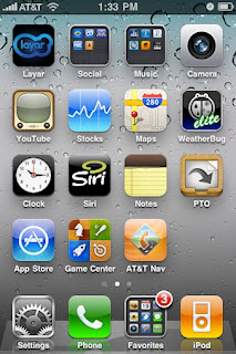
Look at the following pictures. Which one appears more fluid?
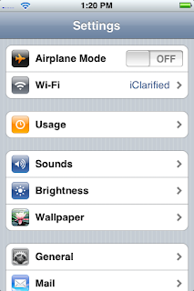
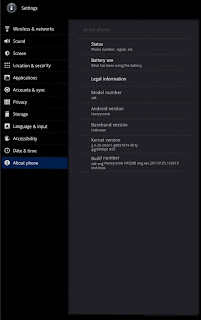
I'd argue the left one and for a few reasons.
1. Color Differentiation - Human beings are visual creatures with highly tuned eyes to allow differentiation of objects. Apple has taken advantage of that by coalescing the icon look to be stereotypical of the setting title (photos is flower) while making sure to change colors on each one. This allows faster navigation of the menus because you can intuitively track where things are based upon color. The Android menu is black and white though still uses pictures. It appears by lacking color contrast you are actually confusing the user because how natural is it to experience black and white in everyday life? By going against the biological system of the user, systems that are finely tuned for many things, you are hindering the interface.
2. Too much text - The less text the better. The best interface is one where you don't even need to read anything. Games such as Angry Birds, does this incredibly well because they use pictographic means to navigate across menus. Apple vs. Android systems show this again.
3. Layout - This goes with point 2 which is apple makes you drill down into the menu. The idea that you should *only* be shown the screen you are on is an idea I like very much. It helps keep cohesion and prevent confusion.
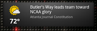
This Facebook interface shows the thought that must go into the filtering of a tremendous amount of information. This is another part that has come to light after doing a lot of initial research. All systems have data filtering to one degree or another. Having thoughts and interfaces that take advantage for navigation need lots of optimizations. Listed above are a few but yet another is the logical filtering of information. What is the main purpose of the system? What information hierarchically lies above another? How can you segment up the raw data into easy to find ways? Facebook shows some nifty ways on achieving success with an obscene amount of data.
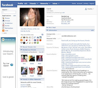
Here you can see the picture shows prominently on the screen with the navigation bar on top filtering to what is most important to the user. Profile or Newsfeed I would argue are the most important.
Which is why the Profile page now looks like this (Newfeed when you login)
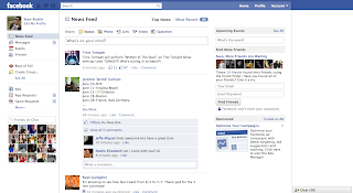
Facebook decided the Newsfeed was the most important and rearranged the title navigation bar. Search and Status boxes are centrally focused along with having the auxiliary pieces like messages, requests, etc. shown in icon form on the top navigation panel with the overlay if something new happens. Again, taking advantage (and interesting effect) of the visual system of human being.
Point 2. Know the purpose of the software and your audience. Use location/spatial organization in order to funnel actions towards where it is most needed / desired.
Point 3. Less is more. Looking at arguably the best designed interface in the world (and the current shift from OS X to the App Centric Design) is very intriguing. What was found here is the less text/information to process by the user the more successful the interface is. Here you can have a maximum amount of possible "actions" by the user which helps filter where they will go along with reducing the information processing needed. The dock in the bottom allows for even more reduction because these are persistent no matter where one goes. Think about the infinite combinations of the Android desktop? Each developer can make their own widget? Widgets are a plethora of choices? And you have at least 3 screens to add all these widgets. Much too much information. Apple /just/ added the ability to have notifications in a drop down menu. My bet is because having a user base get acclimated to the system is important plus knowing a maximum amount of actions that should be allowable is needed research. Apple only lets Apple have information pop up into their notification bar and only they can add custom features to the home screen.
This provides good initial foundations for going forward in the research along with having this *core* to the design/functional/development process for the weather app. Code updates, research paper findings, and general good stuff will be continually updated as the summer progresses.
The purpose of this post is to accentuate the subtle but important aspect of having a visual component in the application process. Now this seems *very* obvious and I'm sure everyone thinks this but to really nail it down is something that I don't believe many people have done. The purpose of software is to be powerful and easy to use. It should do *exactly* what is purports but theoretically should be able to be done in one click / tap.
Look at the following pictures. Which one appears more fluid?


I'd argue the left one and for a few reasons.
1. Color Differentiation - Human beings are visual creatures with highly tuned eyes to allow differentiation of objects. Apple has taken advantage of that by coalescing the icon look to be stereotypical of the setting title (photos is flower) while making sure to change colors on each one. This allows faster navigation of the menus because you can intuitively track where things are based upon color. The Android menu is black and white though still uses pictures. It appears by lacking color contrast you are actually confusing the user because how natural is it to experience black and white in everyday life? By going against the biological system of the user, systems that are finely tuned for many things, you are hindering the interface.
2. Too much text - The less text the better. The best interface is one where you don't even need to read anything. Games such as Angry Birds, does this incredibly well because they use pictographic means to navigate across menus. Apple vs. Android systems show this again.
3. Layout - This goes with point 2 which is apple makes you drill down into the menu. The idea that you should *only* be shown the screen you are on is an idea I like very much. It helps keep cohesion and prevent confusion.
This Facebook interface shows the thought that must go into the filtering of a tremendous amount of information. This is another part that has come to light after doing a lot of initial research. All systems have data filtering to one degree or another. Having thoughts and interfaces that take advantage for navigation need lots of optimizations. Listed above are a few but yet another is the logical filtering of information. What is the main purpose of the system? What information hierarchically lies above another? How can you segment up the raw data into easy to find ways? Facebook shows some nifty ways on achieving success with an obscene amount of data.

Here you can see the picture shows prominently on the screen with the navigation bar on top filtering to what is most important to the user. Profile or Newsfeed I would argue are the most important.
Which is why the Profile page now looks like this (Newfeed when you login)

Facebook decided the Newsfeed was the most important and rearranged the title navigation bar. Search and Status boxes are centrally focused along with having the auxiliary pieces like messages, requests, etc. shown in icon form on the top navigation panel with the overlay if something new happens. Again, taking advantage (and interesting effect) of the visual system of human being.
Point 2. Know the purpose of the software and your audience. Use location/spatial organization in order to funnel actions towards where it is most needed / desired.

Point 3. Less is more. Looking at arguably the best designed interface in the world (and the current shift from OS X to the App Centric Design) is very intriguing. What was found here is the less text/information to process by the user the more successful the interface is. Here you can have a maximum amount of possible "actions" by the user which helps filter where they will go along with reducing the information processing needed. The dock in the bottom allows for even more reduction because these are persistent no matter where one goes. Think about the infinite combinations of the Android desktop? Each developer can make their own widget? Widgets are a plethora of choices? And you have at least 3 screens to add all these widgets. Much too much information. Apple /just/ added the ability to have notifications in a drop down menu. My bet is because having a user base get acclimated to the system is important plus knowing a maximum amount of actions that should be allowable is needed research. Apple only lets Apple have information pop up into their notification bar and only they can add custom features to the home screen.
This provides good initial foundations for going forward in the research along with having this *core* to the design/functional/development process for the weather app. Code updates, research paper findings, and general good stuff will be continually updated as the summer progresses.
Friday, May 27, 2011
Note on Blog Interface + Initial Research
Even looking at the blog interface chosen (on purpose of course) it becomes clear some of the small nuances that effect the flow to an interface. Rounded edges to the centered text window (containing blog text) removes the harsh edges that portray discontinuity. Moreover, a slightly blurred background adds to realism because of the idea that as humans we do not see the things outside our vision that we do not focus on. Nice touches but important to pinpoint why they are advantageous.
Findings:
- Realism in innovative ways (Blurred background. Rounded Edges)
- Text/Font clear and rounded
- Soft Shadows add to realism
Initial Directions for Generic Research include:
iOS Guidelines: They have the most defined expectations for user experience. Good starting point
iOS Guidelines
Android UI: Good place to see differences between established UI kings and competitors. Allows to see how revisions in new 3.0 operating system UI compares to previous along with Apple's.
Google UI Patterns
Android Tutorial: One persons' view on UI. Depending on findings will allow pitfalls/best practices to be examined.
Blog Opinion
Android UI book: Industry practices
Industry Practices
Exploring the change in Win 7 UI
Win 7 Mango
Wiki the "public" view on UI
Wikipedia
More to come
Subscribe to:
Comments (Atom)